Flutter 学习笔记
概述
本文紧接上文 Flutter 环境搭建,主要介绍了 Flutter 学习过程中的常用链接、命令
常用链接
常用命令
MacOS 环境:
# 打开模拟器
open -a Simulator

# 创建项目
flutter create my_app

# 运行项目
flutter run

# 热加载项目
# 在 VSCode 终端 or AndroidStudio 中按下 R 键

# 查看布局网格线
# 在 VSCode 终端 or AndroidStudio 中按下 P 键

# 更多
# Flutter run key commands.
# r Hot reload. 🔥🔥🔥
# R Hot restart.
# h List all available interactive commands.
# d Detach (terminate "flutter run" but leave application running).
# c Clear the screen
# q Quit (terminate the application on the device).
目录介绍
├── .dart_tool dart 第三方依赖 ├── .idea 编译器相关 ├── README.md ├── analysis_options.yaml 分析 dart 语法的文件,老项目升级成新项目有警告信息的话,可以删除此文件 ├── android Android 资源目录 ├── build ├── flutter01.iml ├── ios iOS 资源目录 ├── lib 项目目录 │ └── main.dart ├── linux linux 平台资源目录 ├── macos mac 平台资源目录 ├── pubspec.lock ├── pubspec.yaml 项目依赖、版本 ├── test 测试代码目录 ├── web web 目录 └── windows windows 平台资源目录
MacOS 生成方式
tree | pbcopy前期重点关注 lib 目录和 pubspec.yaml 文件
Hero Travel
组件介绍
MaterialApp
封装了应用程序实现 Material Design 所需要的一些 Widget,一般作为顶层 widget 使用,常用的属性:
- home(主页)
- title(标题)
- color(颜色)
- theme(主题)
- routes(路由) ……
设置 AppBar 主题色
void main(List<String> args) {
  runApp(MaterialApp(
    theme: ThemeData(primarySwatch: Colors.purple),
    home: Scaffold(
      appBar: AppBar(
        title: const Text('Home'),
      ),
      body: const Center(
        child: Text('Text'),
      ),
    ),
  ));
}
Scaffold
Scaffold 是 Material Design 布局结构的基本实现,此类提供了用于显示 drawer、snackbar 和底部 sheet 的 API
Scaffold 有下面几个主要属性:
- appBar:显示在页面顶部的一个 AppBar
- body:当前页面所显示的主要内容 Widget
- drawer:抽屉菜单控件 ……
示例:
void main(List<String> args) {
  runApp(MaterialApp(
    home: Scaffold(
      appBar: AppBar(
        title: const Text('首页'),
      ),
      body: const Center(
        child: Text(
          'hello, flutter',
          textDirection: TextDirection.ltr,
          style: TextStyle(color: Colors.red),
        ),
      ),
    ),
  ));
}
Container
类似 div,主要有以下属性:
- alignment:对其方式,topCenter 顶部居中对齐,topLeft 顶部左对齐……
- decoration:设置背景颜色、圆角、边框、阴影等
- margin:外边距
- padding:内边距
- transform:类似 css transform
- height:容器高度
- width:容器宽度
- child:容器子元素
示例:
class MyApp extends StatelessWidget {
  const MyApp({super.key});

  @override
  Widget build(BuildContext context) {
    return Center(
        child: Container(
      alignment: Alignment.center,
      width: 200,
      height: 200,
      decoration: BoxDecoration(
          color: Colors.yellow,
          border: Border.all(color: Colors.red, width: 2),
          borderRadius: BorderRadius.circular(5),
          boxShadow: const [BoxShadow(color: Colors.blue, blurRadius: 20)],
          gradient: const LinearGradient(colors: [Colors.red, Colors.yellow])),
      child: const Text(
        'hello, flutter',
        style: TextStyle(color: Colors.white),
      ),
    ));
  }
}
按钮示例:
class MyButton extends StatelessWidget {
  const MyButton({super.key});

  @override
  Widget build(BuildContext context) {
    return Container(
      width: 200,
      height: 50,
      decoration: BoxDecoration(
          color: Colors.blue, borderRadius: BorderRadius.circular(10)),
      margin: const EdgeInsets.fromLTRB(0, 20, 0, 0),
      alignment: Alignment.center,
      child: const Text(
        '确定',
        style: TextStyle(color: Colors.white, fontSize: 18),
      ),
    );
  }
}
Text
- textAlign:文本对齐方式
- textDirection:文本方向
- overflow:文本超出屏幕之后的处理方式
- textScaleFactor:字体显示倍率
- maxLines:文字显示最大行数
- style:字体的样式设置
TextStyle 属性:
- decoration:文本装饰线(删除、下划线等)
- decorationColor:文本装饰线颜色
- decorationStyle:文本装饰线风格(虚线、实线……)
- wordSpacing:单词间隙
- letterSpacing:字母间隙
- fontStyle:文本样式(斜体、正常体)
- fontSize:文本大小
- color:文本颜色
- fontWeight:字体粗细
示例:
class MyText extends StatelessWidget {
  const MyText({super.key});

  @override
  Widget build(BuildContext context) {
    return Container(
      width: 200,
      height: 200,
      decoration: const BoxDecoration(color: Colors.black),
      margin: const EdgeInsets.fromLTRB(0, 30, 0, 0),
      child: const Text(
        '你好你好你好你好你好你好你好你好你好你好你好你好',
        style: TextStyle(
            color: Colors.white,
            fontSize: 20,
            fontWeight: FontWeight.bold,
            letterSpacing: 2),
        textAlign: TextAlign.left,
        overflow: TextOverflow.ellipsis,
      ),
    );
  }
}
Image
类似 img 标签
- Image.network 从网络加载图片
- Image.asset 从本地加载图片
属性:
- fit:BoxFit,类似背景图片的几种方式,fill、cover、contain……
- repeat:ImageRepeat,平铺
- width:宽度高度结合 ClipOval 才有效
- height
背景图片实现方式
decoration: BoxDecoration(
  image: const DecorationImage(
    image: NetworkImage(url),
    fix: BoxFit.cover
  )
)
ClipOval
圆角图片
class MyClipOval extends StatelessWidget {
  const MyClipOval({super.key});

  @override
  Widget build(BuildContext context) {
    return ClipOval(
      child: Image.network(
          'https://i1.hdslb.com/bfs/face/0cd621a535d99cc5eed5bd9243355c21d64a0e39.jpg@240w_240h_1c_1s_!web-avatar-space-header.avif',
          width: 150,
          height: 150,
          fit: BoxFit.cover),
    );
  }
}
本地加载图片,首先要到 pubspec.yaml 文件 flutter 属性下添加图片资源
flutter:
    assets:
        - imgs/a.jpg
        - imgs/1.0x/a.jpg
        - imgs/2.0x/a.jpg
Flutter 会自动根据设备屏幕分辨率加载对应尺寸图片
class LocalImage extends StatelessWidget {
  const LocalImage({super.key});

  @override
  Widget build(BuildContext context) {
    return Container(
      width: 200,
      height: 200,
      child: Image.asset('imgs/a.jpg'),
    );
  }
}
ListView
列表布局是项目开发中最常见的一种布局方式,在 Flutter 中通过 ListView 来定义列表项
列表组件常用参数:
- scrollDirection
- padding
- resolve,组件反向排序
- children,列表元素
简单的 ListView
class HomePage extends StatelessWidget {
  const HomePage({super.key});

  @override
  Widget build(BuildContext context) {
    return ListView(
      children: const <Widget>[
        // 列表项
        ListTile(
          leading: Icon(Icons.home, color: Colors.blue,),
          title: Text('这是一个列表项'),
          trailing: Icon(Icons.chevron_right_sharp),
        ),
        // 分割线
        Divider(),
        ListTile(
          leading: Icon(Icons.propane, color: Colors.purple,),
          title: Text('这是一个列表项'),
          trailing: Icon(Icons.chevron_right_sharp),
        ),
        Divider(),
        ListTile(
          leading: Icon(Icons.unarchive_rounded, color: Colors.pink,),
          title: Text('这是一个列表项'),
          trailing: Icon(Icons.chevron_right_sharp),
        ),
        Divider(),
      ],
    );
  }
}
横向的 ListView
class HomePage extends StatelessWidget {
  const HomePage({super.key});

  @override
  Widget build(BuildContext context) {
    return SizedBox(
      height: 100,
      child: ListView(
        scrollDirection: Axis.horizontal,
        padding: const EdgeInsets.all(10),
        children: <Widget>[
          Container(
            width: 200,
            // 高度是自适应,设置没有效果
            height: 100,
            decoration: const BoxDecoration(color: Colors.red),
          ),
          Container(
            width: 200,
            decoration: const BoxDecoration(color: Colors.green),
          ),
          Container(
            width: 200,
            decoration: const BoxDecoration(color: Colors.blue),
          )
        ],
      ),
    );
  }
}
使用 ListView.builder 创建 ListView
class HomePage extends StatelessWidget {
  const HomePage({super.key});

  @override
  Widget build(BuildContext context) {
    return ListView.builder(
      itemCount: 5,
      itemBuilder: (context, index) {
        return ListTile(title: Text('这是第$index条数据'));
      },
    );
  }
}
GridView
GridView 创建网格列表主要有以下三种方式:
GridView.countGridView.extentGridView.builder
常用属性:
- scrollDirection,滚动方法
- padding,内边距
- resolve:组件反向排序
- crossAxisSpacing,水平子 Widget 之间的间距
- mainAxisSpacing,垂直子 Widget 之间的间距
- crossAxisCount,一行 Widget 数量(int 用在 GridView.count)
- maxCrossAxisExtend,横轴子元素的最大长度(double 用在 GridView.extent)
- childAspectRatio:子 Widget 宽高比例
- children
- gridDelegate:控制布局,主要用在 GridView.builder
示例:
class HomePage extends StatelessWidget {
  const HomePage({super.key});

  List<Container> _createBoxs(int count) {
    List<Container> list = [];
    for (var i = 0; i < count; i++) {
      list.add(Container(
        alignment: Alignment.center,
        decoration: const BoxDecoration(color: Colors.blue),
        child: Text(
          '第$i个元素',
          style: const TextStyle(fontSize: 20),
        ),
      ));
    }

    return list;
  }

  @override
  Widget build(BuildContext context) {
    return GridView.count(
      crossAxisCount: 2,
      padding: const EdgeInsets.all(10),
      crossAxisSpacing: 10,
      mainAxisSpacing: 10,
      childAspectRatio: 2,
      children: _createBoxs(8),
    );
  }
}
通过 builder 进行构造:
class HomePage extends StatelessWidget {
  const HomePage({super.key});

  Widget _createBoxs(context, index) {
    return Container(
      alignment: Alignment.center,
      decoration: const BoxDecoration(color: Colors.blue),
      child: Text(
        '第$index个元素',
        style: const TextStyle(fontSize: 20),
      ),
    );
  }

  @override
  Widget build(BuildContext context) {
    return GridView.builder(
        padding: const EdgeInsets.all(10),
        itemCount: 8,
        gridDelegate: const SliverGridDelegateWithFixedCrossAxisCount(
          crossAxisCount: 2,
          crossAxisSpacing: 10,
          mainAxisSpacing: 10,
          childAspectRatio: 2,
        ),
        itemBuilder: _createBoxs);
  }
}
Padding
给 child 添加 padding,功能单一
class HomePage extends StatelessWidget {
  const HomePage({super.key});

  @override
  Widget build(BuildContext context) {
    return Container(
      padding: const EdgeInsets.all(10),
      child: const Text('home'),
    );
  }
}

// 如果只添加 padding 效果,使用 pdding 组件
class HomePage extends StatelessWidget {
  const HomePage({super.key});

  @override
  Widget build(BuildContext context) {
    return const Padding(padding: EdgeInsets.all(10), child: Text('home'));
  }
}
Row
控制一行元素显示方式,类似 flex 布局,常用属性:
- mainAxisAlignment:主轴的排序方式
- crossAxisAlignment:次轴的排序方式
- children:组件子元素
crossAxisAlignment 相对于父容器的位置 外部没有 Container,行是自适应的
示例:
void main(List<String> args) {
  runApp(MaterialApp(
    theme: ThemeData(primarySwatch: Colors.blue),
    home: Scaffold(
      appBar: AppBar(
        title: const Text('Home'),
      ),
      body: Container(
        width: 400,
        height: 600,
        padding: const EdgeInsets.all(10),
        child: Row(
            mainAxisAlignment: MainAxisAlignment.spaceAround,
            crossAxisAlignment: CrossAxisAlignment.center,
            children: [
              MyIcon(Icons.home, Colors.blue),
              MyIcon(Icons.search, Colors.pink)
            ]),
      ),
    ),
  ));
}

class MyIcon extends StatelessWidget {
  Color color;
  IconData icon;

  MyIcon(this.icon, this.color, {super.key});

  @override
  Widget build(BuildContext context) {
    return Container(
      alignment: Alignment.center,
      width: 120,
      height: 120,
      color: color,
      child: Icon(icon, color: Colors.white, size: 28),
    );
  }
}扩展:double.infinity 和 double.maxFinite 可以让当前元素的 width 或 height 达到父元素的尺寸
Column
控制一列的显示方式,类似 flex 布局,flex-direction: column,常用属性
- mainAxisAlignment:主轴的排序方式
- crossAxisAlignment:次轴的排序方式
- children:组件子元素
Flex Expanded
Flex 组件可以沿着水平方向或垂直方向排列子组件,如果知道主轴方向,使用 Row、Column 更方便,因为 Row 和 Column 都继承自 Flex,参数基本相同
可以结合 Flex、Expanded 实现弹性布局
宽度比 2:1
// 直接使用 Row
void main(List<String> args) {
  runApp(MaterialApp(
    theme: ThemeData(primarySwatch: Colors.blue),
    home: Scaffold(
      appBar: AppBar(
        title: const Text('Home'),
      ),
      body: Container(
        width: double.infinity,
        padding: const EdgeInsets.all(10),
        child: Row(children: [
          Expanded(flex: 2, child: MyIcon(Icons.home, Colors.blue)),
          Expanded(flex: 1, child: MyIcon(Icons.search, Colors.pink))
        ]),
      ),
    ),
  ));
}

// 使用 Flex
void main(List<String> args) {
  runApp(MaterialApp(
    theme: ThemeData(primarySwatch: Colors.blue),
    home: Scaffold(
      appBar: AppBar(
        title: const Text('Home'),
      ),
      body: Container(
        width: double.infinity,
        padding: const EdgeInsets.all(10),
        child: Flex(direction: Axis.horizontal, children: [
          Expanded(flex: 2, child: MyIcon(Icons.home, Colors.blue)),
          Expanded(flex: 1, child: MyIcon(Icons.search, Colors.pink))
        ]),
      ),
    ),
  ));
}
左边宽度自适应,右侧固定
void main(List<String> args) {
  runApp(MaterialApp(
    theme: ThemeData(primarySwatch: Colors.blue),
    home: Scaffold(
      appBar: AppBar(
        title: const Text('Home'),
      ),
      body: Container(
        width: double.infinity,
        padding: const EdgeInsets.all(10),
        child: Flex(direction: Axis.horizontal, children: [
          Expanded(flex: 1, child: MyIcon(Icons.home, Colors.blue)),
          MyIcon(Icons.search, Colors.pink)
        ]),
      ),
    ),
  ));
}
Stack
可以使用 Stack 或者 Stack 结合 Align、Positioned 来实现页面的定位
- alignment:配置所有子元素的显示位置
- children:子组件
案例一:让所有子组件居中显示
class MyStack extends StatelessWidget {
  const MyStack({super.key});

  @override
  Widget build(BuildContext context) {
    return Stack(
      alignment: Alignment.center,
      children: [
        Container(
          width: 200,
          height: 200,
          color: Colors.blue
        ),
        Container(
          width: 100,
          height: 100,
          color: Colors.orange,
        ),
        const Text('Hello')
      ],
    );
  }
}
Positioned 组件的属性:
- top:子元素距离顶部的距离
- bottom:子元素距离底部的距离
- left:子元素距离左侧距离
- right:子元素距离右侧距离
- child:子组件
- width:子组件的宽度(该组件宽度、高度必须是固定值,没法使用 double.infinity)
- height:子组件的高度
案例二:红色盒子元素左下角显示,文本靠右 top 100 显示
class MyStack extends StatelessWidget {
  const MyStack({super.key});

  @override
  Widget build(BuildContext context) {
    return Container(
      width: 300,
      height: 300,
      color: Colors.blue,
      child: Stack(
        children: [
          Positioned(
            bottom: 0,
            left: 0,
            child: Container(
              width: 100,
              height: 100,
              color: Colors.red
            ),
          ),
          const Positioned(
            top: 100,
            right: 0,
            child: Text('hello')
          )
        ],
      ),
    );
  }
}
Stack 组件是相对于外部容器进行定位,如果没有外部容器就相对于整个屏幕进行定位
案例三:带导航栏的列表
class MyStack extends StatelessWidget {
  const MyStack({super.key});

  @override
  Widget build(BuildContext context) {
    final size = MediaQuery.of(context).size;

    return Stack(
      children: [
        ListView(
          padding: const EdgeInsets.only(top: 50),
          children: const [
            // 此处有 100 个列表项
            // ...
            ListTile(title: Text('这是一个列表项')),
          ],
        ),
        Positioned(
            top: 0,
            left: 0,
            child: Container(
              width: size.width,
              height: 50,
              color: Colors.black,
              alignment: Alignment.center,
              child: const Text(
                '二级菜单',
                style: TextStyle(color: Colors.white),
                textAlign: TextAlign.center,
              ),
            ))
      ],
    );
  }
}
Flutter 查询设备宽高 API:
MediaQuery.of(context).size;
Align
Center 组件是 Align 组件的子组件,只控制子元素在父元素中的显示位置
案例:控制文本在 Container 右中显示
class MyStack extends StatelessWidget {
  const MyStack({super.key});

  @override
  Widget build(BuildContext context) {
    return Container(
      width: 300,
      height: 300,
      color: Colors.red,
      child: const Align(
        alignment: Alignment.centerRight,
        child: Text('hello'),
      ),
    );
  }
}
AspectRatio
控制元素的宽高比
示例:设置高度为宽度的一半:
class MyStack extends StatelessWidget {
  const MyStack({super.key});

  @override
  Widget build(BuildContext context) {
    return AspectRatio(aspectRatio: 2 / 1, child: Container(color: Colors.red));
  }
}
Card
Card 是卡片组件块,常用属性:
- margin
- child
- elevation:阴影的深度
- color:背景颜色
- shadowColorl:阴影颜色
- margin:外边距
- clipBehavior:内容溢出裁剪方式(值为 Clip 类型)
- Shape:阴影效果,默认为长方形边
示例:名片
class MyStack extends StatelessWidget {
  const MyStack({super.key});

  @override
  Widget build(BuildContext context) {
    return ListView(
      children: [
        Card(
          shape:
              RoundedRectangleBorder(borderRadius: BorderRadius.circular(10)),
          elevation: 10,
          margin: const EdgeInsets.all(10),
          child: Column(children: const [
            ListTile(
              title: Text(
                'zhangsan',
                style: TextStyle(fontSize: 24),
              ),
              subtitle: Text('高级软件开发工程师'),
            ),
            Divider(),
            ListTile(title: Text('Tel: 183xxxxxxxx'))
          ]),
        ),
        Card(
          shape:
              RoundedRectangleBorder(borderRadius: BorderRadius.circular(10)),
          elevation: 10,
          margin: const EdgeInsets.all(10),
          child: Column(children: const [
            ListTile(
              title: Text(
                'zhangsan',
                style: TextStyle(fontSize: 24),
              ),
              subtitle: Text('高级软件开发工程师'),
            ),
            Divider(),
            ListTile(title: Text('Tel: 183xxxxxxxx'))
          ]),
        )
      ],
    );
  }
}
CircleAvatar
class MyStack extends StatelessWidget {
  const MyStack({super.key});

  @override
  Widget build(BuildContext context) {
    return const CircleAvatar(
        backgroundImage: NetworkImage(
            'https://interactive-examples.mdn.mozilla.net/media/cc0-images/grapefruit-slice-332-332.jpg'));
  }
}
Button
按钮组件如下:
- ElevatedButton:普通按钮
- TextButton:文本按钮
- OutlinedButton:边框按钮
- IconButton:图标按钮
class MyPage extends StatelessWidget {
  const MyPage({super.key});

  @override
  Widget build(BuildContext context) {
    return ListView(
      children: [
        Row(
          mainAxisAlignment: MainAxisAlignment.spaceAround,
          children: [
            ElevatedButton(
                onPressed: () {
                  print('click elevated button');
                },
                child: const Text('普通按钮')),
            TextButton(
                onPressed: () {
                  print('click text button');
                },
                child: const Text('文本按钮')),
            OutlinedButton(
                onPressed: () {
                  print('click outline button');
                },
                child: const Text('边框按钮')),
            IconButton(
                onPressed: () {
                  print('click icon button');
                },
                icon: const Icon(Icons.search))
          ],
        ),
        const SizedBox(
          height: 25,
        ),
        Row(
          mainAxisAlignment: MainAxisAlignment.spaceAround,
          children: [
            ElevatedButton.icon(
                onPressed: () {},
                label: const Text('发送'),
                icon: const Icon(Icons.send)),
            TextButton.icon(
                onPressed: () {},
                icon: const Icon(Icons.info),
                label: const Text('信息')),
            OutlinedButton.icon(
                onPressed: () {},
                icon: const Icon(Icons.add),
                label: const Text('增加'))
          ],
        ),
        const SizedBox(height: 25),
        // 修改按钮背景颜色
        Row(
          mainAxisAlignment: MainAxisAlignment.spaceAround,
          children: [
            ElevatedButton(
                style: ButtonStyle(
                    backgroundColor: MaterialStateProperty.all(Colors.red),
                    foregroundColor: MaterialStateProperty.all(Colors.white)),
                onPressed: () {},
                child: const Text('普通按钮'))
          ],
        ),
        const SizedBox(height: 25),
        // 修改按钮尺寸(可以在按钮外层添加 SizedBox 或者 Container)
        Row(
          mainAxisAlignment: MainAxisAlignment.center,
          children: [
            SizedBox(
              width: 100,
              height: 40,
              child: ElevatedButton(onPressed: () {}, child: const Text('确定')),
            )
          ],
        ),
        const SizedBox(height: 25),
        // 通过 Expanded 组件实现自适应按钮
        Row(
          mainAxisAlignment: MainAxisAlignment.center,
          children: [
            Expanded(
                flex: 1,
                child: Container(
                  margin: const EdgeInsets.all(10),
                  child: SizedBox(
                    height: 40,
                    child: ElevatedButton(
                      style: ButtonStyle(
                          backgroundColor:
                              MaterialStateProperty.all(Colors.red),
                          foregroundColor:
                              MaterialStateProperty.all(Colors.white)),
                      child: const Text('登录'),
                      onPressed: () {},
                    ),
                  ),
                ))
          ],
        ),
        const SizedBox(height: 25),
        // 圆角按钮
        Row(
          mainAxisAlignment: MainAxisAlignment.center,
          children: [
            ElevatedButton(
              style: ButtonStyle(
                  shape: MaterialStateProperty.all(RoundedRectangleBorder(
                      borderRadius: BorderRadius.circular(20)))),
              onPressed: () {},
              child: const Text('圆角按钮'),
            ),
            ElevatedButton(
              style: ButtonStyle(
                  shape: MaterialStateProperty.all(const CircleBorder(
                      side: BorderSide(color: Colors.yellow)))),
              onPressed: () {},
              child: const Text('圆角按钮'),
            ),
          ],
        ),
        const SizedBox(height: 25),
        // 修改边框颜色
        Row(
          mainAxisAlignment: MainAxisAlignment.center,
          children: [
            OutlinedButton(
              style: ButtonStyle(
                  side: MaterialStateProperty.all(
                      const BorderSide(width: 1, color: Colors.red))),
              onPressed: () {},
              child: const Text('边框按钮'),
            )
          ],
        )
      ],
    );
  }
}
Wrap
流式布局,单行内容不足后,换行显示,常用属性:
- direction,主轴的方向
- alignment,主轴对齐方向
- spacing,主轴方向间距
- runSpacing,副轴方向间距
- ……
示例:
class Button extends StatelessWidget {
  String text;
  void Function()? onPressed;
  Button(this.text, {super.key, this.onPressed});

  @override
  Widget build(BuildContext context) {
    onPressed = onPressed ?? () {};

    return ElevatedButton(
      style: ButtonStyle(
        backgroundColor:
            MaterialStateProperty.all(Colors.black12),
        foregroundColor: MaterialStateProperty.all(Colors.black),
      ),
      onPressed: onPressed,
      child: Text(text),
    );
  }
}

class MyPage extends StatelessWidget {
  const MyPage({super.key});

  @override
  Widget build(BuildContext context) {
    return Padding(
      padding: const EdgeInsets.all(10),
      child: Wrap(
        alignment: WrapAlignment.start,
        // 水平间距
        spacing: 10,
        // 垂直间距
        runSpacing: 10,
        // 排列方向
        // direction: Axis.vertical,
        children: [
          Button('第一集'),
          Button('第二集'),
          Button('第三集'),
          Button('第四集'),
          Button('第五集'),
          Button('第六集'),
          Button('第七集'),
          Button('第八集'),
          Button('第九集'),
        ],
      ),
    );
  }
}
BottomNavigationBar
常用属性:
items:List 底部导航条按钮集合iconSize:iconcurrentIndex:默认选中第几个onTap:选中后的回调函数fixedColor:选中的颜色type:BottomNavigationBarType.fixed、BottomNavigationBarType.shifting,若底部有 4 个及其以上菜单项,需要配置
lib/main.dart
import 'package:flutter/material.dart';
import './pages/tabs/tabs.dart';

void main(List<String> args) {
  runApp(const MyApp());
}

class MyApp extends StatelessWidget {
  const MyApp({super.key});

  @override
  Widget build(BuildContext context) {
    return MaterialApp(
      title: 'Demo',
      theme: ThemeData(primarySwatch: Colors.blue),
      home: const Tabs(),
    );
  }
}
lib/pages/tabs/tabs.dart
import 'package:flutter/material.dart';
import './home.dart';
import './category.dart';
import './setting.dart';

class Tabs extends StatefulWidget {
  const Tabs({super.key});

  @override
  State<Tabs> createState() => _TabsState();
}

class _TabsState extends State<Tabs> {
  int _current = 0;
  final List<String> _titleList = const [
    'Home',
    'Category',
    'Settring',
  ];
  final List<Widget> _pageList = const [
    HomePage(),
    CategoryPage(),
    SettingPage(),
  ];

  @override
  Widget build(BuildContext context) {
    return Scaffold(
      appBar: AppBar(title: Text(_titleList[_current])),
      body: _pageList[_current],
      bottomNavigationBar: BottomNavigationBar(
        currentIndex: _current,
        items: const [
          BottomNavigationBarItem(icon: Icon(Icons.home), label: '首页'),
          BottomNavigationBarItem(icon: Icon(Icons.category), label: '分类'),
          BottomNavigationBarItem(icon: Icon(Icons.settings), label: '设置')
        ],
        onTap: (index) {
          setState(() {
            _current = index;
          });
        },
      ),
    );
  }
}
lib/pages/tabs/home.dart
import 'package:flutter/material.dart';

class HomePage extends StatefulWidget {
  const HomePage({super.key});

  @override
  State<HomePage> createState() => _HomePageState();
}

class _HomePageState extends State<HomePage> {
  @override
  Widget build(BuildContext context) {
    return const Center(
      child: Text(
        'Home Page',
        style: TextStyle(fontSize: 24),
      ),
    );
  }
}
lib/pages/tabs/category.dart
import 'package:flutter/material.dart';

class CategoryPage extends StatefulWidget {
  const CategoryPage({super.key});

  @override
  State<CategoryPage> createState() => _CategoryPageState();
}

class _CategoryPageState extends State<CategoryPage> {
  @override
  Widget build(BuildContext context) {
    return const Center(
      child: Text(
        'Category Page',
        style: TextStyle(fontSize: 24),
      ),
    );
  }
}
lib/pages/tabs/setting.dart
import 'package:flutter/material.dart';

class SettingPage extends StatefulWidget {
  const SettingPage({super.key});

  @override
  State<SettingPage> createState() => _SettingPageState();
}

class _SettingPageState extends State<SettingPage> {
  @override
  Widget build(BuildContext context) {
    return const Center(
      child: Text(
        'Setting Page',
        style: TextStyle(fontSize: 24),
      ),
    );
  }
}
FloatingActionButton
通过 Scaffold.floatingActionButton 进行设置
基础案例可见自定义组件 - StatefuleWidget
中间底部浮动按钮案例,紧接 BottomNavigationBar 章节 Tabs 组件,build 方法
Widget build(BuildContext context) {
  return Scaffold(
    appBar: AppBar(title: Text(_titleList[_current])),
    body: _pageList[_current],
    // 使用 Container 调整 FloatingActionButton 大小和位置
    floatingActionButton: Container(
      width: 60,
      height: 60,
      padding: const EdgeInsets.all(5),
      margin: const EdgeInsets.only(top: 0),
      decoration: BoxDecoration(
        color: Colors.white,
        borderRadius: BorderRadius.circular(30),
      ),
      child: FloatingActionButton(
        child: const Icon(Icons.add),
        onPressed: () {
          setState(() {
            _current = 1;
          });
        },
      ),
    ),
    // 配置浮动位置
    floatingActionButtonLocation: FloatingActionButtonLocation.centerDocked,
    bottomNavigationBar: BottomNavigationBar(
      type: BottomNavigationBarType.fixed,
      currentIndex: _current,
      items: const [
        BottomNavigationBarItem(icon: Icon(Icons.home), label: '首页'),
        BottomNavigationBarItem(icon: Icon(Icons.category), label: '分类'),
        BottomNavigationBarItem(icon: Icon(Icons.settings), label: '设置')
      ],
      onTap: (index) {
        setState(() {
          if (index != 1) {
            _current = index;
          }
        });
      },
    ),
  );
}
Drawer
侧边栏,通过 Scaffold.drawer、Scaffold.endDrawer 属性分别设置左、右侧侧边栏
Widget build(BuildContext context) {
  return Scaffold(
    appBar: AppBar(title: Text(_titleList[_current])),
    body: _pageList[_current],
	// ...
    drawer: Drawer(
      child: Column(
        children: [
          Row(
            children: const [
              Expanded(
                flex: 1,
                child: DrawerHeader(
                  decoration: BoxDecoration(color: Colors.blue),
                  child: Text('Header'),
                ),
              )
            ],
          ),
          const ListTile(
            leading: CircleAvatar(
              child: Icon(Icons.people),
            ),
            title: Text('个人中心'),
          ),
          const Divider(),
          const ListTile(
            leading: CircleAvatar(
              child: Icon(Icons.settings),
            ),
            title: Text('设置中心'),
          ),
          const Divider(),
        ],
      ),
    ),
    endDrawer: const Drawer(
      child: Text('右侧侧边栏内容'),
    ),
  );
}
如果是介绍用户,那么可以使用现成的
UserAccountsDrawerHeader组件
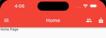
AppBar
常用属性:
- leading:在标题前显示一个控件,在首页通常显示应用的 logo,在其它页面通常显示为返回按钮
- title:标题,通常显示为当前界面的标题文字,可以放组件
- actions:通常使用 IconButton 来表示,可以放按钮组
- bottom:通常放 TabBar,标题下面显示一个 Tab 导航栏
- backgroundColor:导航背景颜色
- iconTheme:图标样式
- centerTitle:标题是否居中显示
import 'package:flutter/material.dart';

void main(List<String> args) {
  runApp(const MyApp());
}

class MyApp extends StatelessWidget {
  const MyApp({super.key});

  @override
  Widget build(BuildContext context) {
    return const MaterialApp(
      title: 'Demo',
      debugShowCheckedModeBanner: false,
      home: HomePage(),
    );
  }
}

class HomePage extends StatefulWidget {
  const HomePage({super.key});

  @override
  State<HomePage> createState() => _HomePageState();
}

class _HomePageState extends State<HomePage> {
  @override
  Widget build(BuildContext context) {
    return Scaffold(
      appBar: AppBar(
        // 左侧按钮图标
        leading: IconButton(
          icon: const Icon(Icons.menu),
          onPressed: (() {
            print('点击左侧按钮图标');
          }),
        ),
        title: const Text('Home'),
        backgroundColor: Colors.red,
        // 右侧按钮图标
        actions: [
          IconButton(
            icon: const Icon(Icons.people),
            onPressed: () {
              print('点击了右侧按钮1');
            },
          ),
          IconButton(
            icon: const Icon(Icons.cake),
            onPressed: () {
              print('点击了右侧按钮2');
            },
          ),
        ],
        centerTitle: true,
      ),
      body: const Text('Home Page'),
    );
  }
}
在 MaterialApp 中,通过
debugShowCheckedModeBanner属性控制是否显示 debug 标签
Dialog
AlertDialog、SimpleDialog、
自定义组件
在 Flutter 中自定义组件其实就是一个类,这个类需要继承 StatelessWidget/StatefulWidget
- StatelessWidget 是无状态组件,状态不可变的 widget
- StatefulWidget 是有状态组件,持有的状态可能在 widget 生命周期改变
StatelessWidget
class MyApp extends StatelessWidget {
  const MyApp({super.key});

  @override
  Widget build(BuildContext context) {
    return const Center(
      child: Text(
        'Hello, Flutter!',
        textDirection: TextDirection.ltr,
        style: TextStyle(color: Colors.red),
      ),
    );
  }
}
快速生成方式:stateW + Enter,需要安装 Awesome Flutter Snippets 扩展程序
StatefulWidget
import 'package:flutter/material.dart';

void main(List<String> args) {
  runApp(const MyApp());
}

class MyApp extends StatelessWidget {
  const MyApp({Key? key}) : super(key: key);

  @override
  Widget build(BuildContext context) {
    return MaterialApp(
      title: 'Demo',
      theme: ThemeData(primarySwatch: Colors.blue),
      home: const HomePage(),
    );
  }
}

class HomePage extends StatefulWidget {
  const HomePage({super.key});

  @override
  State<HomePage> createState() => _HomePageState();
}

class _HomePageState extends State<HomePage> {
  int _count = 0;

  @override
  Widget build(BuildContext context) {
    return Scaffold(
      appBar: AppBar(title: const Text('Home')),
      body: Center(
        child: Column(mainAxisAlignment: MainAxisAlignment.center, children: [
          Text(
            '$_count',
            style: Theme.of(context).textTheme.headline2,
          ),
          const SizedBox(
            height: 50,
          ),
          ElevatedButton(
              onPressed: () {
                setState(() {
                  _count++;
                });
              },
              child: const Text('增加'))
        ]),
      ),
      floatingActionButton: FloatingActionButton(
        onPressed: () {
          setState(() {
            _count++;
          });
        },
        child: const Icon(Icons.add),
      ),
    );
  }
}
动态列表案例:
class HomePage extends StatefulWidget {
  const HomePage({super.key});

  @override
  State<HomePage> createState() => _HomePageState();
}

class _HomePageState extends State<HomePage> {
  final List<String> _list = [];

  @override
  Widget build(BuildContext context) {
    return Scaffold(
      appBar: AppBar(title: const Text('Home')),
      floatingActionButton: FloatingActionButton(
        onPressed: () {
          // 改变数据必须加上 setState()
          setState(() {
            _list.add('这是一个列表项');
          });
        },
        child: const Icon(Icons.add),
      ),
      body: ListView(
        children: _list.map(((str) {
          return ListTile(
            title: Text(str),
          );
        })).toList(),
      ),
    );
  }
}
自带图标组件
Icon 组件,可以使用 Icons 来引用内置图标,并且可以设置图标尺寸、颜色等
class HomePage extends StatelessWidget {
  const HomePage({super.key});

  @override
  Widget build(BuildContext context) {
    return Column(children: const [
      // 该组件可用来设置间距
      SizedBox(
        height: 20,
      ),
      Icon(
        Icons.home,
        size: 30,
      ),
      Icon(
        Icons.settings,
        size: 40,
        color: Colors.purple,
      )
    ]);
  }
}支持的图标列表:https://fonts.google.com/icons
自定义图标
除了 Material 的图标外,我们也可以使用自定义图标,在 Flutter 中使用 ttf 格式实现:
1、下载字体图标,在项目配置文件(pubspec.yaml)中声明:
iconfont 中选择好图标后,点击【下载代码】,即可获得相应的 ttf 文件
flutter:
    fonts:
        - family: myFont # 指定字体名
          fonts:
              - asset: fonts/iconfont.ttf
        - family: Trajan Pro
          fonts:
              - asset: fonts/TrajanPro.ttf
              - asset: fonts/TrajanPro_Bold.ttf
                weight: 700
                style: italic
2、创建字体组件
class MyFont {
  // 微信图标
  static const IconData wechat = IconData(
    // iconfont 下载代码解压 json 文件 中的 unicode 编码
    0xe658,
    // 在 pubspec.yaml 文件中定义的字体名
    fontFamily: 'myFont',
    matchTextDirection: true
  );

  // 鲜花图标
  static const IconData flower = IconData(
    0xe63d,
    fontFamily: 'myFont',
    matchTextDirection: true
  );
}
3、使用字体组件
import './font.dart';

class HomePage extends StatelessWidget {
  const HomePage({super.key});

  @override
  Widget build(BuildContext context) {
    return Column(children: const [
      // 该组件可用来设置间距
      SizedBox(
        height: 20,
      ),
      Icon(
        Icons.home,
        size: 30,
        color: Colors.purple,
      ),
      SizedBox(
        height: 20,
      ),
      Icon(
        MyFont.wechat,
        size: 40,
        color: Colors.blue,
      ),
      SizedBox(
        height: 20,
      ),
      Icon(
        MyFont.flower,
        size: 50,
        color: Colors.red,
      )
    ]);
  }
}
路由
在 Flutter 中通过 Navigator 组件管理路由导航,分为基本路由和命名路由
基本路由
class HomePage extends StatelessWidget {
  const HomePage({super.key});

  @override
  Widget build(BuildContext context) {
    return Scaffold(
      appBar: AppBar(title: const Text('Home')),
      body: Center(
        child: ElevatedButton(
          child: const Text('跳转到搜索页面'),
          onPressed: () {
            Navigator.of(context).push(
              MaterialPageRoute(builder: (context) {
                return const SearchPage();
              }),
            );
          },
        ),
      ),
    );
  }
}
传参:
import 'package:flutter/material.dart';

class SettingPage extends StatefulWidget {
  final String id;
  const SettingPage({super.key, required this.id});

  @override
  State<SettingPage> createState() => _SettingPageState();
}

class _SettingPageState extends State<SettingPage> {
  @override
  Widget build(BuildContext context) {
    return Scaffold(
      appBar: AppBar(title: const Text('设置')),
      body: Text('用户id: ${widget.id}'),
    );
  }
}
命名路由
import 'package:flutter/material.dart';
import './search.dart';
import './setting.dart';

void main(List<String> args) {
  runApp(const MyApp());
}

class MyApp extends StatelessWidget {
  const MyApp({super.key});

  @override
  Widget build(BuildContext context) {
    return MaterialApp(
      title: 'Demo',
      // home: HomePage(),
      initialRoute: '/',
      routes: {
        '/': (context) => const HomePage(),
        '/setting': (context) => const SettingPage(),
        '/search': (context) => const SearchPage()
      },
    );
  }
}

class HomePage extends StatelessWidget {
  const HomePage({super.key});

  @override
  Widget build(BuildContext context) {
    return Scaffold(
      appBar: AppBar(title: const Text('Home')),
      body: Center(
        child: ElevatedButton(
          child: const Text('跳转到设置页面'),
          onPressed: () {
            Navigator.pushNamed(context, '/setting');
          },
        ),
      ),
    );
  }
}
路由传值
// main.dart
import 'package:flutter/material.dart';
import './search.dart';
import './setting.dart';

void main(List<String> args) {
  runApp(MyApp());
}

class MyApp extends StatelessWidget {
  // 1、定义路由
  final Map routes = {
    '/': (context) => const HomePage(),
    '/setting': (context) => const SettingPage(),
    '/search': (context, {arguments}) => SearchPage(arguments: arguments)
  };
  MyApp({super.key});

  @override
  Widget build(BuildContext context) {
    return MaterialApp(
      title: 'Demo',
      // home: HomePage(),
      initialRoute: '/',
      // 2、配置 onGenerateRoute 固定写法
      onGenerateRoute: (RouteSettings settings) {
        // 路由名称
        final String? name = settings.name;
        final Function? pageContentBuilder = routes[name];
        if (pageContentBuilder != null) {
          if (settings.arguments != null) {
            final Route route = MaterialPageRoute(builder: (context) =>
              pageContentBuilder(context, arguments: settings.arguments)
            );
            return route;
          } else {
            final Route route = MaterialPageRoute(builder: (context) =>
              pageContentBuilder(context));
              return route;
          }
        }
        return null;
      }
    );
  }
}

class HomePage extends StatelessWidget {
  const HomePage({super.key});

  @override
  Widget build(BuildContext context) {
    return Scaffold(
      appBar: AppBar(title: const Text('Home')),
      body: Center(
        child: ElevatedButton(
          child: const Text('跳转到搜索页面'),
          onPressed: () {
            Navigator.pushNamed(context, '/search', arguments: {
              'name': 'zhangsan',
              'age': 22
            });
          },
        ),
      ),
    );
  }
}

// search.dart
import 'package:flutter/material.dart';

class SearchPage extends StatelessWidget {
  final Map arguments;
  const SearchPage({super.key, required this.arguments});

  @override
  Widget build(BuildContext context) {
    print(this.arguments);

    return Scaffold(
      appBar: AppBar(title: const Text('搜索')),
      body: Column(
        mainAxisAlignment: MainAxisAlignment.center,
        children: const [Text('这是搜索页面')],
      ),
    );
  }
}
路由操作
- 返回上一级
Navigator.of(context).pop();- 替换路由
Navigator.of(context).pushReplacementNamed('/search');- 返回到根路由
Navigator.of(context).pushAndRemoveUntil 方法案例
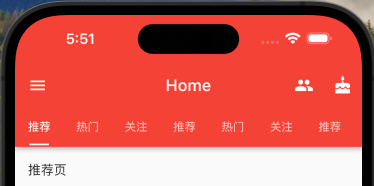
Tabbar TabBarView 实现类似头条顶部导航
1、混入 SingleTicketerProviderStateMixin
class _HomePageState extends State<HomePage> with SingleTickerProviderStateMixin {}2、定义 TabController
late TabController _tabController;

@override
void initState() {
    super.initState();
    _tabController = TabController(length: 3, vsync: this);
}
TabBar 常用属性:
- tabs:显示的标签内容,一般使用 Tab 对象,也可以是其它 Widget
- controller:TabController 对象
- isScrollable:是否可滚动
- indicatorColor:指示器颜色
- indicatorHeight:指示器高度
- indicatorPadding:地步指示器的 Padding
- indicator:指示器 decoration,例如边框等
- indicatorSize:指示器大小计算方式,TabBarIndicatorSize.label 跟文字等宽,TabBarIndicatorSize.tab 跟每个 tab 等宽
- labelColor:选中 label 颜色
- labelStyle:选中 label 的 Style
- labelPadding:每个 label 的 Padding
- unselectedLabelColor:未选中 label 颜色
- unselectedLabelStyle:未选中 label 的 Style
class _HomePageState extends State<HomePage>
    with SingleTickerProviderStateMixin {
  late TabController _tabController;

  // 生命周期函数:当组件初始化的时候触发
  @override
  void initState() {
    super.initState();
    _tabController = TabController(length: 9, vsync: this);
  }

  @override
  Widget build(BuildContext context) {
    return Scaffold(
      appBar: AppBar(
        // 左侧按钮图标
        leading: IconButton(
          icon: const Icon(Icons.menu),
          onPressed: (() {
            print('点击左侧按钮图标');
          }),
        ),
        title: const Text('Home'),
        backgroundColor: Colors.red,
        // 右侧按钮图标
        actions: [
          IconButton(
            icon: const Icon(Icons.people),
            onPressed: () {
              print('点击了右侧按钮1');
            },
          ),
          IconButton(
            icon: const Icon(Icons.cake),
            onPressed: () {
              print('点击了右侧按钮2');
            },
          ),
        ],
        centerTitle: true,
        bottom: TabBar(
          controller: _tabController,
          isScrollable: true,
          indicatorColor: Colors.white,
          indicatorWeight: 2,
          indicatorPadding: const EdgeInsets.all(2),
          indicatorSize: TabBarIndicatorSize.label,
          tabs: const [
            Tab(
              child: Text('推荐'),
            ),
            Tab(
              child: Text('热门'),
            ),
            Tab(
              child: Text('关注'),
            ),
            Tab(
              child: Text('推荐'),
            ),
            Tab(
              child: Text('热门'),
            ),
            Tab(
              child: Text('关注'),
            ),
            Tab(
              child: Text('推荐'),
            ),
            Tab(
              child: Text('热门'),
            ),
            Tab(
              child: Text('关注'),
            ),
          ],
        ),
      ),
      body: TabBarView(
        controller: _tabController,
        children: const [
          ListTile(
            title: Text('推荐页'),
          ),
          ListTile(
            title: Text('热门页'),
          ),
          ListTile(
            title: Text('关注页'),
          ),
          ListTile(
            title: Text('推荐页'),
          ),
          ListTile(
            title: Text('热门页'),
          ),
          ListTile(
            title: Text('关注页'),
          ),
          ListTile(
            title: Text('推荐页'),
          ),
          ListTile(
            title: Text('热门页'),
          ),
          ListTile(
            title: Text('关注页'),
          ),
        ],
      ),
    );
  }
}