CSS 手写
布局场景题-1
实现以下布局:
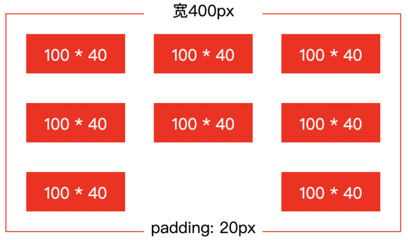
要求:外层盒子宽度不定,确保每个子项宽度 100px,列之间间距跟随变化
flex 布局:
css
/* html结构:div#app>div.item*8 */
* {
    margin: 0;
    padding: 0;
    box-sizing: border-box;
}

#app {
    display: flex;
    flex-wrap: wrap;
    justify-content: space-between;
    row-gap: 40px;
    column-gap: calc((100% - 340px) / 2);
    width: 400px;
    padding: 20px;
    border: 1px solid #ccc;
    margin: 50px auto;
}

#app .item {
    width: 100px;
    height: 40px;
    background-color: red;
}
grid 布局:
css
/* html结构:div#app>div.item*9 */
* {
    margin: 0;
    padding: 0;
    box-sizing: border-box;
}

#app {
    display: grid;
    grid-template-rows: repeat(3, 40px);
    grid-template-columns: repeat(3, 1fr);
    row-gap: 40px;
    column-gap: calc((100% - 300px) / 2);
    width: 400px;
    padding: 20px;
    border: 1px solid #ccc;
    margin: 50px auto;
}

#app .item {
    width: 100px;
    height: 40px;
    background-color: red;
}

#app .item:nth-child(8) {
    background-color: transparent;
}
注意:
grid 布局有容器宽度、grid 布局宽度两个概念,
column-gap中的百分比是基于 grid 布局宽度计算的当前案例
grid-template-columns属性值单位必须设置为fr,使 grid 布局宽度和容器可用空间宽度保持一致,这样column-gap属性值中的百分比才符合常识
grid 布局中,每个格子的宽度、高度是由父元素(
grid-template-columns、grid-template-rows)设置的,而不是由格子内容元素的宽度、高度决定
布局场景题-2
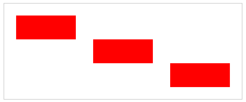
实现以下布局:
flex 布局:
css
/* html结构:div#app>div.item*3 */
* {
    margin: 0;
    padding: 0;
    box-sizing: border-box;
}

#app {
    display: flex;
    flex-direction: column;
    align-items: center;
    width: 400px;
    padding: 20px;
    border: 1px solid #ccc;
    margin: 50px auto;
}

#app .item {
    width: 100px;
    height: 40px;
    background-color: red;
}

#app .item:nth-child(1) {
    align-self: flex-start;
}

#app .item:nth-child(3) {
    align-self: flex-end;
}
grid 布局:
css
/* html结构:div#app>div.item*3 */
* {
    margin: 0;
    padding: 0;
    box-sizing: border-box;
}

#app {
    display: grid;
    grid-template-rows: repeat(3, 40px);
    grid-template-columns: repeat(3, 1fr);
    grid-template-areas:
        'a . .'
        '. b .'
        '. . c';
    width: 400px;
    padding: 20px;
    border: 1px solid #ccc;
    margin: 50px auto;
}

#app .item {
    width: 100px;
    height: 40px;
    background-color: red;
}

#app .item:nth-child(1) {
    grid-area: a;
}

#app .item:nth-child(2) {
    grid-area: b;
}

#app .item:nth-child(3) {
    grid-area: c;
}